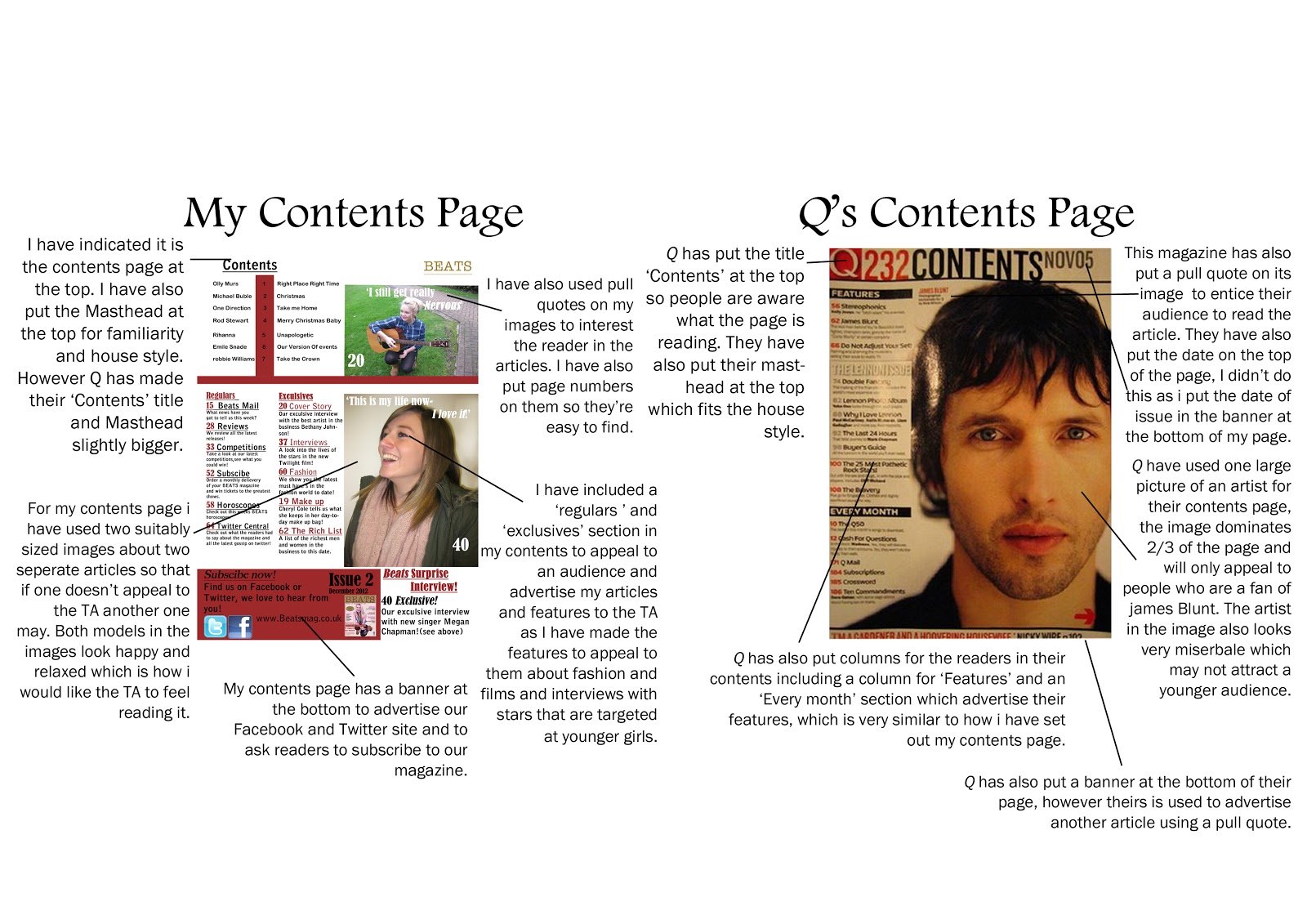
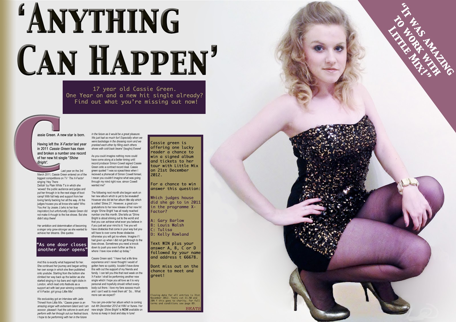
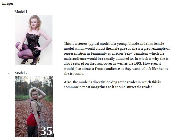
2. How does your media product represent particular social groups?
3. What kind of media institution might distribute your media product and why?
 IPC Media is a British consumer magazine and digital publisher since the mid 1950s' with a portfolio selling over an average mean of 350 million copies a year. IPC Media is a well known publisher with over 26 million reading a UK magazine published by IPC Media so this tells me that my magazine has a greater chance as they are also a big well-known company. I have chosen to publish IPC Media with these reasons as well as their target audience for other magazines such as: NME and Guitar and Bass suit my target audience so my magazine should fit well with the category.
On the website it shows the results for NME magazine in the progression they have made. For example:
"NME reaches over 1.1 million music fans every week." and "as well as a regular look back through the magazine's incredible 60 year heritage" and "intensely engaged audience of 16-24 year-olds". This shows strong reliability over the years which are aimed to the same target audience as my music magazine.
4. Who would be the audience for your media product?
The target audience for my music magazine is people aged 16-24. Both males and female to buy this music magazine. There is no ethnicity for my music magazine as it is provided and aimed for all people. The genre for my music magazine is POP as it is a popular genre and the music magazine can relate to top charts and fits in with you as the audience is aimed for 16-24 year olds. I researched into the product of the target audience by completing a TA analysis questionnaire with participants aged 16-24. The magazine will be produced for any class from middle to high class as this does not affect who should read the magazine as it is widely available for any reader.
5. How did you attract/address your audience?
I have attracted my audience by my TA research of my target audience.
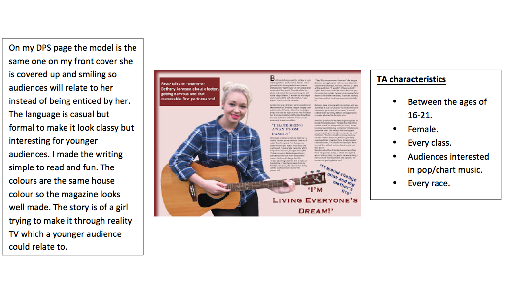
Language: In my music magazine I have used informal language as it seek the teenage and young adults attention easily as it is easier for them to understand compared to formal text which can seem boring so it won’t catch their attention. In my DPS especially I have used slang as it was an interview of a young singer in which she is the same age as my target audience in which they can relate too. I also used different punctuation to grab the readers’ attention even more such as explanation marks.
Contents: In the magazine I have selected key interests from my Ta questionnaire of what they would like to see most in the magazine that they would be interested in reading in which I have taken these comments and applied them to my music magazine. To make them more dominant I have added features and exclusives for their particular interest. For instance latest chart music and interviews with celebrities. I have attracted the audience more by applying bold bright font on the front cover with simple cover lines to attract the reader.
For example:

Font and house style: For the font I used different styles from Serif fonts to San-serif fonts. Also I made them different sizes so they stand out and attract the readers so they are not boring. The houses-style is a bold colour which makes it stand out and the colours I have used are unisex as they can attract male and female readers.
Audience research from TA analysis: In my music magazine I have included adverts. Also I have mentioned internet social-working sites as it appeals to my target audience as their age category for 16-24 year olds are highly reflected for sites such as Facebook and Twitter so you attract your audience as you gain better communication between the reader and the music magazine. I did a TA analysis questionnaire in which people from 16-24 answered my questions on the questionnaire. I then compared the answers against each other to see what my target audience was most interested in. From my results it showed: festivals and concerts, interviews with celebrities and album releases appeared the most popular in which I featured this on my contents page.
6.What have you learnt about technologies from the process of constructing this product?

During the process of creating my music magazine I have learnt a lot about new technology and I have developed my skills widely.
Photography: Digital Nikon Camera
Photography: Digital Nikon Camera
For my images in my music magazine I used a high definition Nikon camera to produce a high quality photo
as it has a higher pixel count than a basic camera or phone.
To create a sharper image you can use a tripod so you have a steady shot.
With this I can create the correct exposure by adjusting the three controls ISO, shutter speed and aperture.
- The aperture controls how much light we let into our sensor. It also determines the depth of field (how much of the scene is in focus), that is measured in f-stops. For example each stop doubles the amount of light we let pass (f/4 is two stops larger than f/8.)
- The Shutter speed determines how the motion of the subject will look in the image. A slow shutter speed will blur fast moving subjects while a fast shutter speed will freeze the subject. Stops are used in shutter speeds such as 1/160s is twice as long as 1/320s.
- The ISO is the sensitivity to light and can be set automatically on the settings without you having to alter it (however you can manually set this up.) ISO 200 is double sensitive compared to ISO 100. A high ISO is suitable for low light images where as a low ISO is suitable for high light images.
I have also learnt the quality of lighting can a affect the image quality as you have different lighting conditions and shadows. For example: If you rely on the weather you have to plan for the weather condition such as a cloudy day gives even but flat lighting where as strong light in woodland areas can be used to frame pictures but when the lighting is too high you get too much contrast and the shadows block the subject.
Image Formats
I have learnt about the different formats of images which has been useful when editing and saving images for my music magazine. For my music magazine I am more likely to use a JPEG image as it is more suitable for image quality and size.
- GIF. - Smaller than a Jpeg but produces purer colours than a JPEG as the colours are limited. (usually for web graphics.)
- TIF. - Highest quality format (usually for commercial work.)
- JPEG. - Compresses the data to a smaller file however the image will loose some of its quality.(mainly used for digital cameras and web pages as the image is just one layer.)
- PNJ. - more recent development. similar to a TIF and JPEG.
Adobe Photoshop
I developed my skills of adobe photo shoot to manipulate and edit my photographs for my front cover, contents page and double page spread.
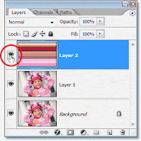
This image shows the different layers you have when creating a music magazine. Each layer layers on top and you can compress/merge the layers together so they lock down. However you cannot un-merge the layers once selected. The eye button hides and shows the layer that has the effect on so that you can just focus on one section of the product when working in detail.
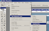
This image shows the editing process. You cant adjust:
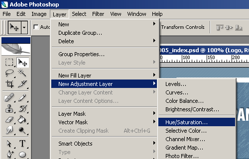
 This image shows the different tools you can use to edit the images. The main tools to edit my photographs are:
I developed my skills of adobe photo shoot to manipulate and edit my photographs for my front cover, contents page and double page spread.
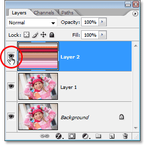
This image shows the different layers you have when creating a music magazine. Each layer layers on top and you can compress/merge the layers together so they lock down. However you cannot un-merge the layers once selected. The eye button hides and shows the layer that has the effect on so that you can just focus on one section of the product when working in detail.
This image shows the editing process. You cant adjust:
- Levels: The brightness and contrast of the image.
- High/Saturation:
- Sharpen: The focus of the image (blur/sharp effect)
- Size: The canvas size of the image (like on DPS I extended the white background to apply the text with the model still remaining on the left.)
- Clone Stamp: Copy a portion of an image and reapply it repeatedly to cover an unwanted portion of the image.
- Crop: Select an image and crop down to the size you require.
- Colour Sampler: View colour values in defined spots of the image. (like on the coloured boxes that matched the costume colour on the DPS)
- Eye Dropper: Defines the foreground / background colour.
- Shape Tools: Apply a shape. E.g. Rectangle (like the layout for each page.)
- Text: Apply text to the image.
- Magic Wand: Selected areas of the photograph which you can further edit the selected area or delete that area of the image.
- Move: Moves/duplicates a selected image or area or layer.
Scanner
I have also used a scanner to upload work onto the blog from my research of other magazines.
Other Skills
I have developed my technology skills by using a mac. Also different programmes on the mac which are listed above like Adobe, but also internet explorer as it allowed me to research the forms and conventions of a music magazine along with using a Blog to update my progress on my production of the music magazine.
7. Looking back at your preliminary task, what do you feel you have learnt in the progression from it to the full product?
Comparing the Preliminary Task to my final product of the front cover magazines I feel that I have massively progressed by learning new techniques and programmes to complete the full product. Instantly in the Front cover you can see the improvement straight away from layout, compositions, photography and text styles.
7. Looking back at your preliminary task, what do you feel you have learnt in the progression from it to the full product?
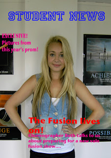
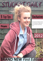
Full Product: Front Cover Magazine

Preliminary Task: Front Cover

Preliminary Task: Front Cover

Comparing the Preliminary Task to my final product of the front cover magazines I feel that I have massively progressed by learning new techniques and programmes to complete the full product. Instantly in the Front cover you can see the improvement straight away from layout, compositions, photography and text styles.
Fonts: In my Preliminary task I used limited fonts by using the basic sans serif font in the basic black colour. Whereas in my final cover I used a mixture of Serif and San Serif fonts in different colours which co-ordinate to the models outfit and house style colours in this edition of the magazine. This applied to my front cover, contents page and DPS.
I know how to use special effects such as drop shadows to make elements of my music magazine stand out more. Also the colour scheme was matched against the outfit but I fell I have progressed more in my final product music magazine as I had a separate house style which suited my target audience along with the costume coordinating.
By researching other magazines after my preliminary task I feel I have progressed massively as I feel I have produced a strong final outcome from the front cover to the contents page and DPS with a set design layout assembled together. For this I used Adobe Photoshop using the ruler tool to align my columns and headings to make it look more professional.
From the preliminary task I used an apple Iphone 4s as the camera was unavailable but in my final front cover I used high definition Nikon Camera as the pixels produced a better quality photo which became more focused and sharp. However, even though I did not produce a contents page or DPS in my preliminary task I have progressed my photography skills by the pose, costume and variety of photo shoots including the location as this appealed in most magazines. Plus, for my front cover, contents page and DPS I manipulated and developed the photos for a better quality.
For example:
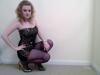 Stage one: Basic image
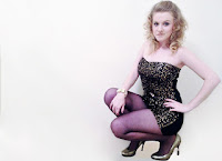 Stage two: Editing image
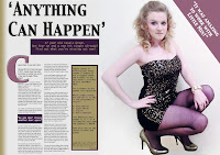 Stage three: DPS
Overall I think I have progress well from my preliminary task to my final product as in my preliminary task I did not have a target audience, genre, house style in mind apart from the aim of a college magazine where as in my final product I research, planning and new technology skills for my music magazine which has now produced a stronger outcome, Also for my music magazine I produced many redrafts until the final product was perfect.
To improve this magazine in the future I would use a wider range of models as I only used 2 for 3/4 different photo shoots.
I know how to use special effects such as drop shadows to make elements of my music magazine stand out more. Also the colour scheme was matched against the outfit but I fell I have progressed more in my final product music magazine as I had a separate house style which suited my target audience along with the costume coordinating.
By researching other magazines after my preliminary task I feel I have progressed massively as I feel I have produced a strong final outcome from the front cover to the contents page and DPS with a set design layout assembled together. For this I used Adobe Photoshop using the ruler tool to align my columns and headings to make it look more professional.
From the preliminary task I used an apple Iphone 4s as the camera was unavailable but in my final front cover I used high definition Nikon Camera as the pixels produced a better quality photo which became more focused and sharp. However, even though I did not produce a contents page or DPS in my preliminary task I have progressed my photography skills by the pose, costume and variety of photo shoots including the location as this appealed in most magazines. Plus, for my front cover, contents page and DPS I manipulated and developed the photos for a better quality.
For example:
 Stage one: Basic image
 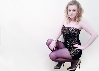 Stage two: Editing image
  Stage three: DPS
Overall I think I have progress well from my preliminary task to my final product as in my preliminary task I did not have a target audience, genre, house style in mind apart from the aim of a college magazine where as in my final product I research, planning and new technology skills for my music magazine which has now produced a stronger outcome, Also for my music magazine I produced many redrafts until the final product was perfect.
To improve this magazine in the future I would use a wider range of models as I only used 2 for 3/4 different photo shoots.